
Newsletter #3

Hey all!
As we approach the end of the year, I’m excited to share the 3rd edition of this new version of my newsletter.
This project was originally intended to be a monthly or bi-weekly edition, but that hasn’t been realistic for me lately. So, I’ll be sending updates whenever I can, hoping you’ll still find them interesting or at least a little entertaining.
Thank you for being here, and enjoy!
Pablo talks to…
Kaliz Lee, a talented designer based in Hong Kong who specialises in newsroom infographics and commercial illustration for both print and digital media. Recently, she was promoted to Assistant Graphics Editor at the South China Morning Post. I had the pleasure of working with her while in Hong Kong, so I’m excited to share her insights.
1. Mention one of your artworks that best represents who you are and what your art is about, and explain why.
I’d say the full-page Children’s Day colouring game I designed for the newspaper is probably the best example of my style. When I’m given creative freedom, I tend to lean towards simple, clean, and minimalist designs, but with a touch of controlled chaos.
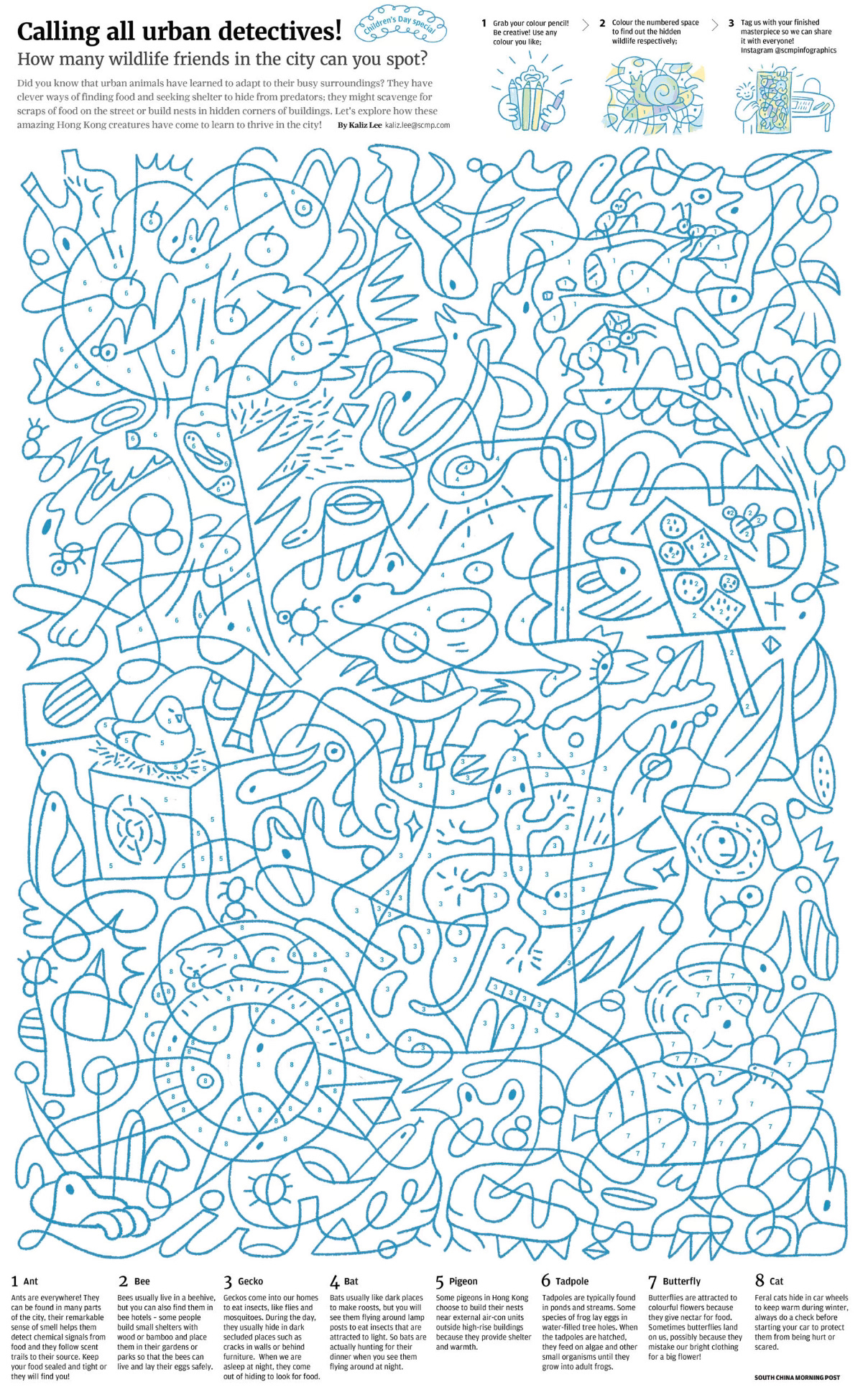
This project really brought together some of my favourite themes: urban observation, animal welfare, and creating content for kids. I love adding little details and surprises, so I turned it into a puzzle-like game where the goal is to spot animals that have adapted to urban life and are cleverly hiding in different corners of the city.
I love mixing different topics, ideas, and fields. It keeps my brain creatively active and often leads to some fun, unexpected results.
2. What’s one common mistake made when choosing a colour palette in graphic design, and how do you think it can be avoided?
Colours that are too similar in infographics can be tough to tell apart, especially for people with visual impairments, like older adults. To make things more accessible, I usually go for high-contrast colour palettes. Before I publish an infographic, I would usually do a final check with a colour blindness simulator to avoid any communication issues.
That said, balancing aesthetics with accessibility can be tricky, and I sometimes get a headache trying to find the right balance.
3. When planning an exhibition, what’s a good way you’ve found to deliver a message through your work?
The conceptualization stage is key for me. I jot down all my thoughts, even if they’re scattered and don't make much sense at first. The more I write, the clearer the idea becomes. It’s a process of constant refining to make sure the message comes through clearly in the end.
4. What is the project you are most proud of, and why do you feel that way about it?
The project I’m most proud of is the subdivided flat living infographic. I feel I managed to capture not just the physical space from my field trip to a subdivided flat in one of Hong Kong’s busiest streets, but also the emotion and memory of that experience.
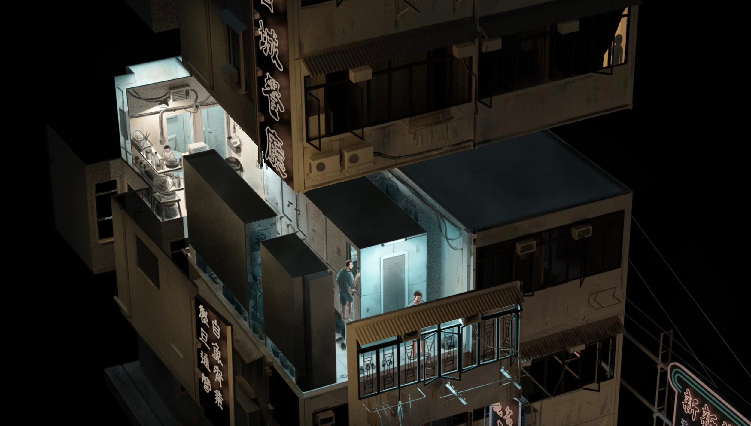
For this project, I focused on 'contrast' and 'surprise'. I used warm colours for the vibrant, neon-lit outdoor scenes and cool tones for the cramped indoor spaces. This contrast highlights the stark difference between the bustling street life and the suffocating conditions inside the tiny rooms. The element of surprise comes through a scrolling effect, where the wall peels away to reveal the flat’s interior, mirroring the shock I felt when I first saw these spaces.
I’m especially happy with how the 3D model blended seamlessly with my illustration. It was so convincing that some people thought it was a photograph, even though it’s a representation of the broader issue, not a specific flat. It blurs the line between reality and representation while still conveying the essence of what I witnessed.
5. What’s the most unexpected source of inspiration you’ve ever encountered?
I've unexpectedly come up with new ideas or solved problems more than once during my daily meditation practice, and I always have to rush to jot them down as soon as the finishing bell rings.
6. What is the main challenge you find when adapting a digital project for print?
The main challenge is accepting that not every detail transfers perfectly between digital and print, there's always a trade-off.
In digital, we work in a dynamic space, using layering, animation, and breaking information into smaller pieces to create depth and guide readers. In print, the challenge is recreating that flow in a static space, finding creative ways to lead the audience’s eyes without the help of animation or interactivity.
7. What new skills did you learn from your most recent work?
I have learnt how to accurately plot an area on a map using QGIS. It’s a tool with so much to offer, but it can be pretty hard to use at the same time.
8. As a designer born and raised in Hong Kong, how do you think the city has shaped the way you design?
I think this is a tough question to answer, because it’s something many people in the city are grappling with—what exactly is Hong Kong, what does it mean to be part of its culture, and where do we fit in the world?
Honestly, I’m not always sure how Hong Kong has shaped my design approach. It’s like asking a fish to describe water, it’s all around me, so it’s hard to see it clearly. But one thing I do know is that I’ve seen people here constantly adapting to the changing times with creativity, and that resilience deeply inspires me.
A vivid example of this comes from my childhood memories of the 90s local TV commercials. They were like mini-dramas, usually centred around romantic stories, especially the ones for phone services. They’d break the story into parts with cliffhangers, releasing them bit by bit. Looking back, these TVCs feel a little corny, but at the time, It was such a huge hit and it caught people’s attention in a way traditional ads couldn’t.
From those innovative TVCs to the way people maximise small living spaces, I feel like Hong Kongers always find new ways to solve problems. I try to bring that same adaptability into my work, always looking for fresh solutions with whatever resources I have.
9. If you could collaborate with any artist or designer, past or present, who would it be and why?
I’d love to collaborate with the prehistoric people who made cave drawings.
On a recent trip to Australia, I learned about the pictograms created by Aboriginal Australians—some of the earliest graphic designers in history. I’m curious how we could work together and communicate using only signs and pictograms.
10. If you could choose a superpower to use for your work, what would it be and why?
Time manipulation. I’d freeze any moment or travel back in time to capture the perfect reference for my work. (I’ve seen enough time travel movies to know the risks of messing with the past, so I’d stick to being just an observer!)
11. Can you recommend any tools (not necessarily related to work) that you find helpful?
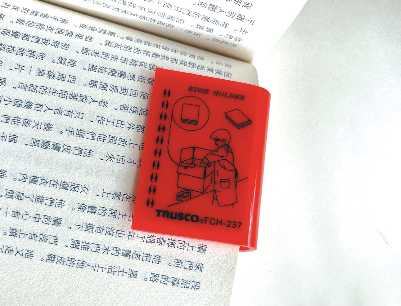
I bought this pack of Trusco carton edge holders entirely because of the charming instruction illustration on the packaging. Plus, they had a bit of a Chindōgu vibe (a Japanese term for quirky inventions made for fun), which I found hilarious. I’ve never actually used them for holding cartons, but they’ve become my go-to bookmarks. When not in use, they make for delightful little decorations on my bookshelf.
Some links:
Global urban polygons and points dataset ◦ How to read satellite, weather, & climate data hidden in tricky data formats by our first guest, Rob Simmon ◦ Online tool to create simple orthographic maps ◦ Open Buildings 2.5D Temporal Dataset, more about it here ◦ 40 years of urban growth, coastline changes ◦ Tree detection in UAV LiDAR and RGB image data ◦ Global database of 58,502 wastewater treatment plants ◦ Global 30m Elevation datasets
Illustrator
◦◦◦ Owen D Pomery ◦◦◦
Latest work:
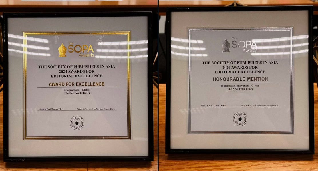
My project, 'How to Cool Down a City,' won in the global infographics category and received an honorable mention for journalism innovation by SOPA.
How Japanese skaters’ dominance may be affected by a new scoring system in Paris during the Olympics.
